Ever wondered why a technically perfect file prints flat on your Canon PIXMA while another image seems to leap off the page, despite identical settings and careful color management?
Many photographers instinctively blame cameras, color profiles, or printer settings, and sometimes those do matter. But more often the unsung culprit is the paper itself—its surface, weight and chemistry dictate how inks sit, how light plays across highlights, whether details remain crisp or soften, and ultimately how colors read.
Paper choice shapes color saturation, contrast and perceived sharpness by controlling ink absorption, dot spread, and light reflection. Finish and texture determine glare and fingerprint visibility while also setting the print’s emotional tone—crisp and punchy for commercial shots, or soft and painterly for portraits and landscapes. In this guide we compare five standout photo papers that work especially well with Canon PIXMA printers, including Canon’s PT-101, LU-101 and PM-101, plus Red River’s Polar Gloss Metallic and Aurora White Fine Art stock, so you can pick the right finish, handling and longevity for your prints.
1. Canon Photo Paper Pro Platinum PT-101

Canon PT-101 Pro Platinum Photo Paper A6 50 sheets
Ultra-bright platinum finish delivers vibrant, gallery-quality A6 prints with exceptional color depth and archival durability.
Check PriceThe Canon Photo Paper Pro Platinum PT-101 is a top-tier glossy paper specifically made for Canon printers, including PIXMA. It’s a heavy 300gsm stock that immediately feels premium in hand and delivers superb color rendition for the images that matter most.
If your work is portraits or vibrant, high-impact images, this paper will make them sing — the brightness and color saturation are exactly what I reach for when I want punch and presence. Be aware the surface is highly reflective; glare is noticeable in bright or uncontrolled lighting, so plan lighting and display accordingly.
User feedback lines up with my experience: excellent brightness, lush color reproduction and long-lasting fade resistance. Because PT-101 is Canon‑optimized for color accuracy with Canon inks, colors print predictably and match what you see on calibrated Canon profiles more closely than generic stocks.
In practice, PT-101 is a go-to when you need gallery-worthy gloss and archival stability — prints look luxurious and handle well thanks to the weight. The trade-off is cost: it runs at a higher price per sheet compared with standard photo papers, so reserve it for your best work or client delivery where the finish and longevity justify the expense.
- superb color saturation/brightness
- heavy 300gsm premium feel
- excellent fade resistance
- Canon‑optimized for color accuracy with Canon inks
- strong reflections/glare in bright light
- higher cost per sheet vs standard papers
2. Canon Photo Paper Pro Luster LU-101
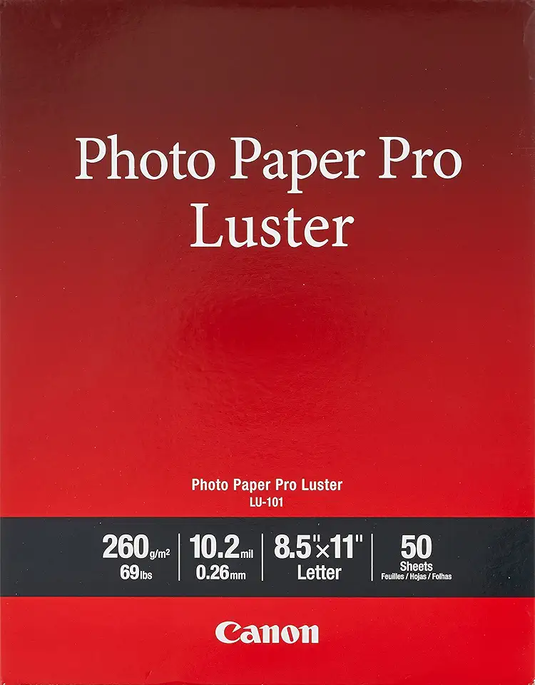
Canon LU-101 Luster Photo Paper Letter 50 sheets
Silky luster surface yields sharp detail and rich tones, perfect for professional letter-size prints and striking presentations.
Check PriceThe Canon Photo Paper Pro Luster LU-101 is a semi-gloss/luster sheet that sits squarely between glossy and matte, and at roughly 300gsm it feels substantial in the hand. As a working photographer I appreciate that balance—it’s glossy enough to give color and contrast a pleasant pop, yet muted enough to avoid the mirror-like reflections of full gloss.
Its surface is noticeably less reflective than full gloss, which cuts down glare and fingerprints. That makes LU-101 a smart choice for prints that will be handled often—albums, client portfolios, and small gallery runs—because the finish keeps attention on the image rather than on stray reflections or smudges.
User feedback highlights rich colors with less shine and good black density, and I see that in practice: blacks remain deep without the sheen overpowering subtler tones. The paper’s 300gsm weight contributes to a professional feel that frames and prints well without flopping or curling.
If you want a versatile paper for family photos, galleries or portfolios, LU-101 is a practical, premium-feel option. Be aware it costs more than standard photo papers and, compared with full gloss, some may perceive a touch less vibrancy—so if you need maximum pop in controlled lighting, consider that trade-off.
- Reduced glare/fingerprint issues
- Excellent color reproduction and black density
- Professional 300gsm weight
- Versatile for family photos, galleries and portfolios
- Pricier than standard photo papers
- Slightly less vibrancy than full gloss (subjective)
3. Canon Photo Paper Pro Premium Matte PM-101

Canon PM-101 Premium Matte Photo Paper 8.5x11 50 sheets
Smooth matte surface minimizes glare for elegant, true-to-color prints ideal for portraits and framing.
Check PriceCanon Photo Paper Pro Premium Matte PM-101 is my go-to when I want a glare-free, gallery-ready print from a PIXMA. Canon describes it as a premium matte option with a non-reflective surface that delivers deep blacks and rich colors, which is exactly what you need for controlled, museum-style presentation.
It’s especially well suited to fine art, wedding photos, portraits and black-and-white work where reflections ruin the mood. In practice the paper gives a restrained, professional matte finish that emphasizes tonal depth rather than punchy gloss-driven saturation.
User feedback consistently praises the PM-101 for its black performance and the professional matte look. If you print larger pieces, note that it’s available up to A2, so you can produce substantial fine-art or exhibition prints without switching suppliers.
The trade-offs are straightforward: some photographers will find colors less “vibrant” than the same image on glossy stock, so if you rely on eye-popping color saturation you might miss that extra pop. Also, the heavier/thicker versions can be a little trickier to feed and handle in smaller offices or on some printers, though Canon offers lighter weights too.
If your work leans toward artistic presentation, monotone portraits, or wedding albums intended for handling and display rather than bright magazine-style prints, PM-101 is an excellent choice. It’s a paper that favors mood, texture and permanence over glossy flashiness — exactly what many fine-art and portrait photographers want.
- No reflective glare
- Strong black performance
- Many sizes including large format (up to A2)
- Excellent for artistic prints
- Matte can make colors look less vivid to some
- Heavier/thicker versions can be harder to handle (lighter versions exist)
4. Red River Polar Gloss Metallic

Red River Polar Gloss Metallic Photo Paper 8.5x11 25 sheets
High-gloss metallic sheen enhances highlights and color brilliance for dazzling, gallery-ready metallic prints.
Check PriceRed River Polar Gloss Metallic is a resin-coated, high-gloss metallic inkjet paper that gives prints a bold, metallic sheen—great for when you want color depth and extra detail to pop. It’s listed as compatible with Canon PIXMA printers, and is designed to produce a glossy-metallic finish rather than a traditional photographic look.
As a working photographer I reach for this paper when a subject benefits from a modern, artistic presentation: portraits, landscapes and art prints all respond well to that unique sheen. User feedback highlights how the metallic finish enhances contrast and color saturation, producing images with a distinctive, attention-grabbing presence.
In practical terms the Polar Gloss Metallic delivers high detail reproduction with Canon inks and offers a premium feel in the hand thanks to its resin coating. Red River provides profiles and recommendations specifically for Canon printers, so you can get closer to accurate color without endless guesswork—handy when you’re prepping work for clients or gallery display.
This paper isn’t for everyone: the metallic sheen leans toward an artistic, modern aesthetic rather than a natural photographic look, so consider whether that style matches your image and audience. It also tends to show fingerprints and smudges more readily than luster or matte papers, so careful handling and finishing are part of the workflow when using it.
- Striking metallic gloss finish
- High detail reproduction with Canon inks
- Premium, resin-coated feel
- Compatible with Canon profiles for accurate color
- Metallic sheen not for every image taste
- Shows fingerprints and smudges easily
5. Red River Aurora White Fine Art Paper

Canon FA-RG1 Premium Fine Art Rough Paper 8.5x11 25 sheets
Textured, archival-quality surface imparts tactile richness and depth to fine-art reproductions and limited-edition prints.
Check PriceRed River Aurora White is a 100% cotton-rag fine-art paper that sits squarely in the archival, gallery-grade category. Its bright white, slightly textured semi-smooth surface gives prints a tactile presence without the glare of glossy stocks.
As a professional, I reach for this paper when the image benefits from subtle surface texture and a warmer, more natural white point. It renders nuanced detail and tone beautifully, especially for fine-art, portrait and black‑and‑white work where you want depth without shine.
Because it’s acid-free and designed for longevity, Aurora White is ideal for exhibition and archival prints that must stand the test of time. The cotton rag base provides a weighty, premium feel that collectors expect from museum-quality prints.
A practical note: this paper rewards careful workflow. Printer profiles from Red River Paper are available for Canon PIXMA printers, and calibration is important to capture the paper’s warmth and texture accurately. Handle the sheets with care to avoid surface oils or marking.
In short, if you’re producing gallery prints, portfolio pieces or archival editions and you prefer a non-gloss, textured finish, Aurora White is a strong choice. If you need ultra-smooth, mirror-like detail or high-gloss pop, however, this isn’t the right stock.
- 100% cotton-rag archival durability
- Bright white semi-smooth surface for crisp detail
- Slightly textured, tactile feel with natural white tone
- Acid-free for long-term storage/display
- Texture not suited to ultra-smooth images
- Requires careful handling and printer calibration
Choosing Photo Paper for Canon PIXMA
Choosing the right paper for your Canon PIXMA comes down to three simple questions: how will the print be viewed, how will it be handled, and how long do you want it to last. If your prints live in a bright, controlled environment and you want punchy color and sharp detail, glossy stocks do the trick. If they’ll be handled, shown under gallery lights, or need a more subtle look, a luster or matte finish will save you from glare and fingerprints.
Whenever possible I reach for genuine Canon papers. They’re formulated for Canon inks, give predictable color accuracy and tend to run through PIXMA feeds with fewer hiccups. That doesn’t mean third‑party brands can’t be excellent, but expect to do a little more calibration when you stray from Canon‑optimized stocks.
Weight and texture matter as much as finish. Heavier stocks (around 300gsm) feel premium, resist curling and often feed more reliably. Textured, cotton‑rag fine art papers add tactile depth for portraits and black‑and‑white work, but they also demand careful printer profiles and handling to get consistent results.
Think about the viewing environment. Smooth, glossy surfaces boost perceived sharpness and contrast but can glare in bright rooms. Matte or lightly textured papers soften highlights and lend a more photographic‑print, gallery look. I choose matte for moody portraits and gloss or metallic finishes for vibrant landscapes and commercial work.
Finally, always run a small test print before a full batch. Use the correct paper setting or ICC profile, allow adequate drying time, and handle originals by the edges. With a little preparation you’ll get prints that match your vision and make the most of your PIXMA’s capabilities.
How Surface Texture Affects Images
Surface texture is one of those quiet creative choices that changes the mood of a print as much as composition or color. The paper’s finish controls how light interacts with ink—so it affects color punch, perceived sharpness, contrast and even how people physically handle the print.
Smooth glossy and high‑gloss metallic surfaces reflect light directly, which makes colors pop, blacks look deeper and fine detail appear razor‑sharp. That extra “snap” is wonderful for landscapes, studio portraits and any image you want to feel modern and vivid, but it also brings glare and fingerprints, so it works best under controlled lighting and when prints aren’t handled constantly.
Luster or semi‑gloss sits nicely between glossy and matte. It retains much of the vibrancy while reducing reflections and smudges. Because of that balance, luster is my go‑to for client portfolios and family albums where you want punch without the nuisance of glare.
Matte and textured fine‑art papers scatter light instead of reflecting it. That softens highlights, reduces specular glare and produces a tactile, painterly look that flatters skin tones and black‑and‑white work. Textured cotton rag stocks also add warmth and presence for gallery prints, though fine detail and micro‑contrast will read differently than on gloss.
Metallic papers offer a unique shimmer that enhances perceived dynamic range and color saturation. They can make images feel three‑dimensional, but that sheen isn’t for every subject or viewer, and they show fingerprints readily.
Practically speaking, match texture to subject, viewing conditions and handling. Use glossy for bright, detailed images in controlled light; choose matte or textured stocks for intimate portraits, B&W and gallery work; pick luster for the best of both worlds. Always make a small test print, view it under the lighting you expect, and tweak sharpening and ICC profiles to compensate for how the surface scatters or reflects light.
What People Ask Most
What is the best photo paper for Canon Pixma printers?
The best paper depends on your print goals and the printer model. Use Canon‑branded or Canon‑compatible inkjet photo papers designed for Pixma printers for the most reliable color and handling.
Can any photo paper be used with a Canon Pixma?
Only papers made for inkjet printing and compatible with your printer should be used to avoid feeding issues and poor results. Always check the paper’s compatibility and recommended ink type before printing.
What is the best paper finish for printing photos on a Canon Pixma — glossy, luster, or matte?
Glossy boosts color vibrancy and perceived sharpness, luster offers a balanced look with reduced glare, and matte removes reflections for an artistic or low‑glare presentation. Choose the finish based on viewing conditions and the aesthetic you want.
What paper settings should I use when printing photos on a Canon Pixma?
Match the printer’s paper type and quality settings to the paper you are using and select an appropriate media mode in the print driver. Use manufacturer profiles or ICC profiles when available for more accurate color reproduction.
How do I load photo paper into a Canon Pixma for best results?
Follow the printer manual for orientation and place the printable side as indicated, adjusting the paper guides to prevent skewing. For heavier or specialty stocks, use the recommended feed tray or manual feed to ensure proper feeding.
Will my Canon Pixma print borderless photos on photo paper?
Many Pixma models support borderless printing on compatible photo papers, but this capability varies by model and paper size. Check your printer’s specifications and driver options to enable borderless printing when available.
What weight (gsm) photo paper is best for Canon Pixma printers?
Heavier papers tend to feel more premium and can sit better for photographic prints, while lighter stocks are easier to handle and more economical. Refer to your printer’s recommended media range and choose a weight that suits your desired finish and handling needs.
Conclusion for Canon PIXMA Photo Paper
In the end, the best paper for your Canon PIXMA comes down to the image you want to show, the finish you prefer, how the print will be handled, and how long you want it to last.
Whenever possible use Canon‑optimized papers and manufacturer profiles, and calibrate your workflow for fine‑art or specialty stocks to get the most accurate and consistent results.
Glossy and metallic finishes tend to emphasize color and contrast, luster offers a balanced middle ground with fewer fingerprints, and matte or textured fine‑art stocks create a glare‑free, tactile presentation better suited to portraits and monochrome work.
If you want to keep improving your printing and presentation skills, explore more articles on our site for practical tips, comparisons, and workflow advice to help you experiment with confidence.
Have questions or want help choosing a paper for a specific project? Leave a comment below — we usually reply within a few hours.

0 Comments