Have you ever watched a movie and felt completely immersed in its world just by the hues and tones on the screen?
This isn’t just the magic of storytelling; it’s the art of color grading working its subtle yet powerful charm.
Color grading, a pivotal process in film and photography, goes beyond color adjustment.
It’s about crafting a visual tone that elevates the narrative and connects with the audience emotionally.

In film and photography, color grading isn’t just an afterthought; it’s a crucial step that shapes the visual identity of the content.
From the eerie greens in “The Matrix” to the vibrant landscapes in “La La Land,” color grading plays a starring role in defining the aesthetic and mood of cinematic works.
This technique is equally significant in photography, where the right color palette can turn a simple image into a memorable masterpiece.
As we embark on this colorful journey, remember that color grading isn’t just about making images look pretty.
It’s a powerful storytelling tool that, when used effectively, can turn your visual content into an immersive and emotionally resonant experience.
Let’s dive into the vibrant world of color grading, decoding its basics, impact, and techniques that bring visuals to life!

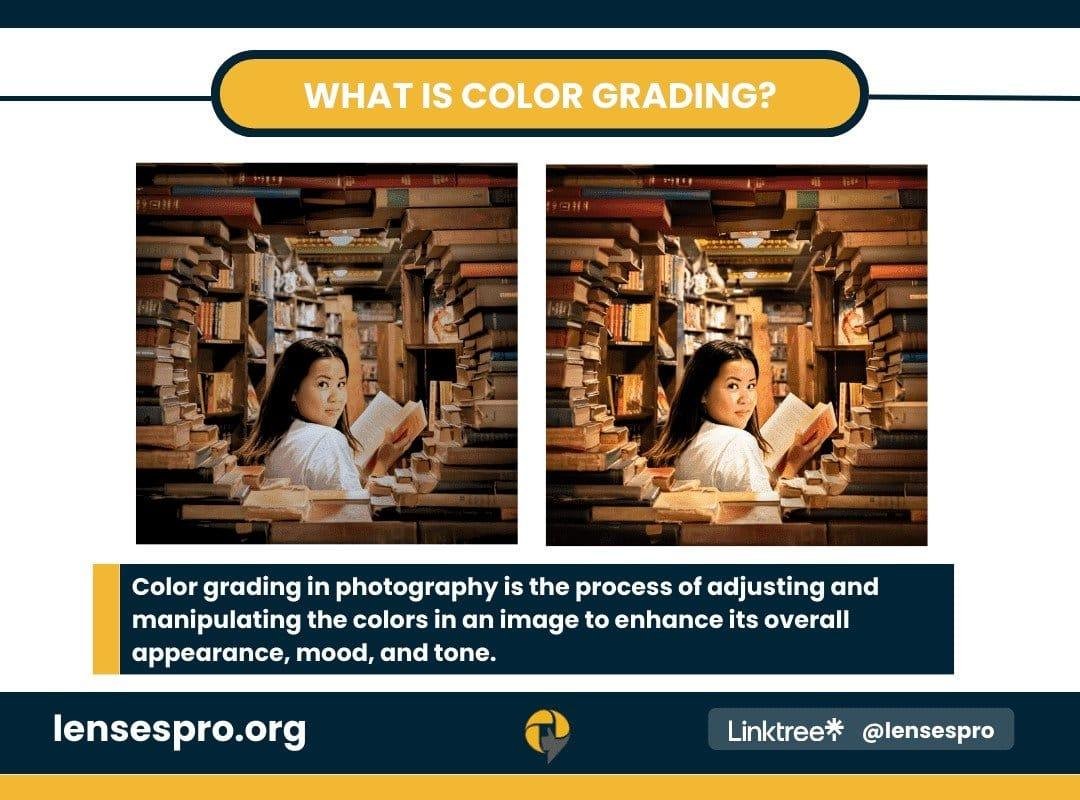
Color grading might sound complex, but it’s pretty straightforward. So, what is color grading? Color grading is altering and enhancing the color of a motion picture, video image, or still photograph. It’s akin to applying a filter with far more precision and creative control.
In different contexts, the color grading meaning varies slightly:
In Film: Color grading is all about setting the tone and mood. It can transform a sunny afternoon into a haunting twilight or a drab scene into a vibrant, dynamic one. This technique adds depth, emotion, and visual interest to the story.
In Photography: Here, color grading ensures that the colors in your photographs are both appealing and accurate, enhancing the overall impact of the image. It could be as subtle as making the blues in a seascape pop or as dramatic as creating a vintage look.
Whether you’re dealing with moving or still images, the essence of color grading remains the same: it’s the art of painting your story with colors. It’s about taking your visuals from ‘what you see’ to ‘what you want to convey.’ By mastering color grading, you can control the narrative of your film or photo, guiding your audience’s emotions and perceptions through colors.
Color Correction vs. Color Grading: Clearing the Confusion
The terms color correction and color grading are often used interchangeably, but they play distinct roles in video editing. Understanding the difference is crucial in mastering the art of color manipulation.
Color Correction is fixing color issues and making footage appear as naturalistic as possible. Think of it as setting the proper foundation – ensuring that whites and blacks are white and all colors in between are true to life. This step is about achieving color consistency, exposure, and white balance across all shots.
Color Grading, on the other hand, is the creative extension of color correction. Once the colors are corrected and consistent, color grading comes into play to give the footage a specific look or mood. This is where a director’s vision comes to life, be it through a warm, nostalgic filter or a cold, bleak ambiance.
Both processes are essential in video editing:
- Color Correction ensures the footage is realistic and uniform.
- Color Grading adds a vibrant or stylistic touch that elevates the visual narrative.
So, while color correction is about accuracy, color grading is aesthetic. Together, they transform the raw footage into a visually cohesive and emotionally resonant piece. Whether working on a small project or a cinematic production, mastering these elements is key to creating visually stunning and emotionally engaging content.
The Art of Cinematic Color Grading

Cinematic color grading is where the visual storytelling of a film truly comes to life. This creative process shapes not just the look but the very feel of a movie. Let’s explore its definition and significance and see it in action through iconic examples.
Definition and Significance: In movies, color grading is the process of stylizing the color palette to enhance or alter the narrative’s tone. It’s a powerful tool in a filmmaker’s arsenal to evoke specific emotions, signify character development, or indicate changes in time or location. It’s about crafting a visual language that speaks directly to the audience’s emotions.
Real-World Examples:
“Mad Max: Fury Road” is a masterclass in color grading. The film uses a vibrant, high-contrast palette that intensifies its world’s chaotic and dystopian nature. Using oranges and blues creates visual interest and helps in storytelling, distinguishing between the harsh desert landscapes and the calmer night scenes.
In “Blade Runner 2049,” color grading is pivotal in creating the mood. Using teal and orange hues creates a futuristic yet nostalgic atmosphere, transporting viewers to an alien and familiar world.
The Palette of Emotions: The colors chosen in color grading can significantly impact emotions. Depending on the context, warm colors like red and orange can evoke feelings of warmth and comfort or tension and danger. Cooler tones like blue and green can create a sense of calm or alienation and detachment. The key is using these colors to support the story and character arcs.
In summary, cinematic color grading isn’t just about making a movie look good; it’s an essential part of storytelling. By understanding and harnessing the power of color, filmmakers can create more immersive, emotionally engaging cinematic experiences.
The Palette of Emotions: How Colors Set the Mood
Color grading in film and photography does more than beautify the image; it’s a key player in setting the mood and shaping the audience’s emotional response. Each color palette tells a different story, influencing how viewers perceive and connect with the visual content.
Naturalistic Color Grading: This style aims for realism, using colors that are true to life. It’s often used in genres like documentaries or biopics, where authenticity is critical. Naturalistic color grading helps viewers relate to the content by reflecting the real world.
Contrast-Based Grading: Contrasting colors create visual interest and highlight specific scene elements. For instance, a warm color for a character in an excellent background can draw attention to them, subtly indicating their importance.
Genre-Specific Grading: Different genres often use distinct color schemes. Horror films might use a muted, dark palette to create a sense of dread, while romantic comedies might opt for brighter, warmer colors to evoke a light-hearted feel.
Understanding how color grading affects mood is crucial. For instance, a scene intended to evoke melancholy might be graded with cooler, desaturated tones, whereas a joyful scene could be enhanced with vibrant, warm colors.
As a beginner, experimenting with different palettes can help you understand the emotional weight colors carry. Remember, the goal of color grading is not just to colorize an image but to imbue it with an emotional depth that resonates with the audience.
Color Grading in Photography: Bringing Pictures to Life
In photography, color grading is vital in transforming good images into great ones. It’s not just about correcting colors; it’s about infusing your photos with mood, tone, and personality.
Importance in Photography: Color grading can make your photographs stand out, giving them a unique look that aligns with your artistic vision. Whether it’s the warmth of a golden hour landscape or the cool tones of a cityscape at dusk, color grading allows you to enhance or completely transform the feel of your images.
Color Grading in Nature Photography: Here, the goal is often to enhance the natural beauty without making it look unnatural. Subtle adjustments can make greens more vibrant in a forest scene or blues more profound in a seascape, adding depth and richness to the picture.
In Portrait Photography: Color grading can complement the mood of the portrait. For example, a moody, low-key portrait might benefit from more relaxed, desaturated colors, while a lively, energetic portrait could be enhanced with bright, warm tones.
Getting Started: As a beginner, experiment with basic adjustments like contrast, saturation, and color balance. Pay attention to how these changes affect the mood of your image. Practice is critical – the more you experiment, the better you’ll understand how to use color grading to bring your artistic vision to life.
In photography, color grading isn’t just a technical step; it’s a creative process that breathes life into your images, helping you tell your story more effectively.
Tools of the Trade: Getting Started with Color Grading

Diving into the world of color grading can initially seem daunting, especially with the available tools and software. However, for beginners, it’s all about starting simple and gradually building your skills. Here’s a guide to help you begin your color-grading journey.
Essential Tools and Software for Beginners
Software Choices: For those just starting, software like Lightworks offers an intuitive interface with essential color grading functions. Adobe Premiere Pro and DaVinci Resolve are popular choices, offering more advanced features as your skills develop.
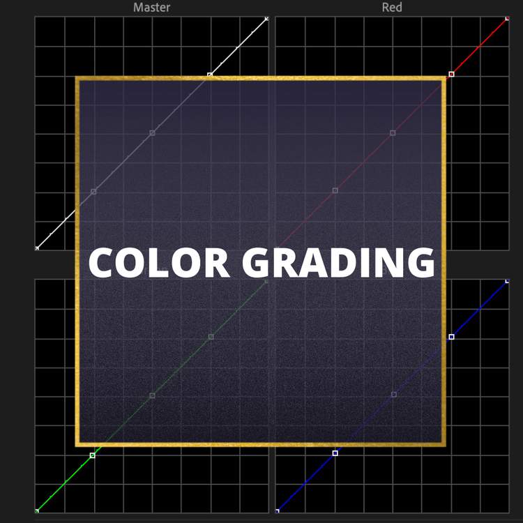
Understanding the Tools: Familiarize yourself with essential tools like color wheels, curves, and sliders. These are your primary instruments for adjusting shadows, mid-tones, and highlights, as well as tweaking saturation and contrast.
Step-by-Step Guide
Start with Color Correction: Ensure your footage or image is color-corrected for a neutral starting point. This means getting your whites to look white and your blacks to look black.
Understand the Mood: Before you start grading, clearly understand the mood or tone you want to convey. This will guide your color choices.
Make Gradual Adjustments: Begin with broad adjustments, like overall contrast and saturation, then move to more specific changes, like tweaking individual color hues.
Experiment with Presets: Many software tools come with preset color grades. While relying on these is tempting, use them as a learning tool. Analyze what each preset does and try to replicate it manually.
Practice Consistency: Ensure your color grading is consistent throughout the scene or project. Consistent color grading can be confusing to the viewer.
Review and Refine: After applying your grade, step away, then come back with fresh eyes to review and make any necessary refinements.
Remember, color grading is as much an art as a technical skill. Your unique style will develop over time, so be patient and enjoy learning and experimenting.
Ensuring Accurate Colors When Filming
Achieving accurate colors during filming is crucial for a smooth post-production process, especially regarding color grading. Here are some techniques and considerations to ensure that what you capture with your camera translates well during the color-grading phase.
Techniques for Accurate Color Capture
Lighting: Good lighting is critical. Natural light provides the most accurate colors, but if you’re using artificial lighting, ensure it’s balanced and consistent. Watch out for mixed lighting sources, which can introduce unwanted color casts.
Camera Settings: Pay attention to the white balance settings in your camera. Accurate white balance means colors look natural and require less correction in post-production. Use a grey or white balance card to set the correct white balance for your shooting environment.
Shooting in RAW: If possible, shoot in RAW format. RAW files retain more information and provide greater flexibility in post-production, allowing for more precise color adjustments.
Importance of Shot Matching and Skin Tone Consistency
Shot Matching: Maintaining color consistency is vital in scenes with multiple shots. This ensures a seamless visual flow, less distracting for the viewer.
Skin Tones: Getting skin tones right is one of the most critical aspects of color grading. They are often the focus of a shot and can be a benchmark for overall color balance. Notice how lighting and your camera’s color profile affect skin tones.
Ensuring accurate colors when filming lays a strong foundation for effective color grading. It reduces the amount of correction needed and allows color grading to focus more on enhancing the mood and style of the footage. Remember, the goal is to create a visually cohesive and believable world where colors support storytelling.
Emerging Trends in Color Grading In 2026
Like any visual media aspect, color grading is subject to trends and evolving styles. In 2026, we’re seeing some exciting developments shaping how color grading is approached in films and photography. Let’s explore these trends and how they might influence future projects.
Current Trends and Techniques in Color Grading
Natural and Authentic Looks: There’s a growing preference for color grades that feel natural and authentic. This trend moves away from heavily stylized looks, focusing instead on subtle enhancements that maintain the raw, natural feel of the footage.
Vintage and Retro Styles: Nostalgia continues to be a powerful force, with vintage color grading styles making a comeback. This includes muted tones, grain textures, and colors that mimic classic film stocks.
Bold and Expressive Colors: On the other end of the spectrum, there’s also a trend towards using bold and expressive color palettes. These are often used to make a strong visual statement, highlight certain scene aspects, or create a unique aesthetic.
HDR (High Dynamic Range) Grading: With more screens supporting HDR, there’s an increased demand for HDR color grading. HDR allows for a broader range of colors and luminance, offering more depth and realism in the image.
Future Outlook
As technology evolves, we expect color grading tools to become more sophisticated, offering greater control and precision. AI and machine learning also play a more significant role, potentially automating some aspects of color grading or providing intelligent suggestions based on the content.
Emerging trends in color grading reflect a broader shift in how we consume and appreciate visual media. Whether it’s the authenticity of the natural look, the nostalgia of retro styles, or the boldness of expressive colors, these trends highlight the ever-evolving nature of visual storytelling. As we move forward, the possibilities for creative expression in color grading continue to expand.
FAQ Section
What is color grading in the video?
Color grading in the video enhances and manipulates the color palette of footage to convey a specific mood, style, or narrative. It involves adjusting elements like saturation, contrast, and color tones to create a cohesive and visually appealing look.
What is color grading in photography?
In photography, color grading refers to altering and enhancing a photograph’s colors to achieve a desired aesthetic or emotional effect. It’s similar to color grading in video but tailored for still images.
What is color grading in film?
Color grading in the film is a post-production process where colorists adjust the colors of the footage to match the director’s vision, set the mood, and ensure visual consistency. It’s crucial for creating the film’s unique visual style.
What is color grading in Lightroom?
Color grading in Adobe Lightroom involves using tools within the software to adjust the color balance and tone of photos. It allows photographers to create a specific mood or style in their images through color manipulation.
What is color timing in film?
Color timing is a traditional term used in film production, referring to adjusting the colors of a film print in the lab. In the digital era, this process has evolved into color grading.
What is a color correction in the film?
Color correction in the film standardizes and balances color throughout the footage. It ensures that the colors are consistent and accurate, serving as a foundation for the more creative color grading process.
What is color grading in nature photography?
Color grading in nature photography involves adjusting colors to enhance the natural beauty of the subject matter. This can include intensifying colors, adding warmth or coolness, or creating a specific atmosphere that complements the wild scene.
What is the difference between color correction and color grading?
Color correction is fixing issues to make the footage look natural and consistent, focusing on accurate colors and exposure. Color grading is a creative step that comes after, where colors are stylized to set the mood or tone of the image or film.
When filming, what must be done to ensure accurate color?
To ensure accurate color when filming, it’s essential to have proper lighting, use consistent settings (mainly white balance) across shots, and ideally shoot in RAW format for greater control in post-production. Using tools like grey cards for reference can also help maintain color accuracy.
Conclusion
As we wrap up our exploration into the vibrant world of color grading, it’s clear that this process is much more than a simple tweak of colors. Whether in film, video, or photography, color grading is a powerful storytelling tool, capable of evoking emotions, setting the mood, and bringing a creative vision to life.
From the naturalistic tones connecting us to the real world to the bold hues transporting us into imaginative realms, color grading shapes how we perceive and engage with visual media. The trends of 2026, with their focus on authenticity, vintage appeal, and bold expressions, underscore this art form’s dynamic and evolving nature.
For beginners eager to embark on this colorful journey, remember to start simple, practice consistently, and let your unique vision guide your way. The world of color grading is a canvas awaiting your personal touch. So, dive in, experiment, and watch your visuals transform from images to passionate stories. Happy coloring!


0 Comments