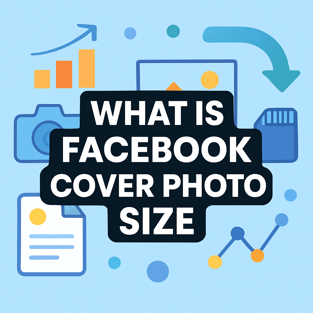
What is Facebook cover photo size? This short guide gives clear, up-to-date answers for 2026.
You will get exact pixel numbers for desktop, mobile, and a master canvas that fits both. I also show the safe zone so faces, logos, and text never get cropped.
Learn how Facebook crops differently on phones and computers and where the profile picture overlaps your image. Follow simple tips to keep key elements centered and visible everywhere.
Plus, find file-type and export tips, a copyable cheat-sheet, and downloadable templates to speed your workflow. Upload, preview on a real phone, and tweak until it looks right.
Facebook Cover Photo Dimensions and Guidelines

If you landed here to learn what is facebook cover photo size, here’s the short answer. On desktop, Facebook displays the cover at 820 by 312 pixels. On phones, it shows a taller crop, so planning is key.
Use this quick line: Desktop 820×312, Mobile 640×360, Master canvas 820×360, Safe area 640×312, Min 400×150, 2× 1640×720. These numbers cover the real-world cases you will meet.
Why the difference? Desktop is a wide 2.63:1, while mobile is 16:9. A single 820×360 canvas gives extra height for mobile while keeping width for desktop.
For crisp results, export a 2× version at 1640×720 and let Facebook downscale. That keeps edges clean on high‑DPI displays and reduces strange compression artifacts. If you want deeper context, this complete guide also tracks layout quirks over time.
Mobile vs. Desktop: How to Ensure Your Cover Photo Looks Great Everywhere
Desktop shows a wide, short slice of your image. Mobile shows a narrower, taller slice that trims the sides. This is the heart of what is facebook cover photo size in practice.
To avoid surprises, center your subject and text inside the 640×312 safe zone. Let backgrounds, gradients, or wide photos bleed beyond that zone. If you must place a subject off‑center, leave negative space toward the edges.
Upload your cover, then use Facebook’s drag‑to‑reposition tool to slide the crop. Check the preview while dragging, then hit Save once the subject sits cleanly in view. Always review on an actual phone before publishing, not just desktop developer tools.
If something still feels off, try nudging the horizon or pattern so the mobile crop feels balanced. You can reupload bigger or smaller versions to influence Facebook’s compression. For more context on crops and spacing, see these practical cover size tips and compare with your preview.
Designing with the profile picture overlap in mind
Your profile picture overlaps the cover and can hide key visuals. On most profiles it sits lower‑left or center‑left, while on Pages it may shift slightly. Design assuming an overlap so nothing important gets buried.
Keep faces, logos, calls‑to‑action, and small text clear of that overlap area. Treat the overlap as a frame: a subject can lead toward the profile photo, or a texture can flow underneath. Still, keep core information inside the central 640×312 safe rectangle.
I like to build a simple template at 820×360 with a square overlay where the avatar sits. Drop guides for the safe rectangle so you can compose fast and repeatably. Use contrast, negative space, and subtle leading lines so the story reads even when part is covered.
Always check the current layout before finalizing. Facebook moves things.
File type and size recommendations for desktop
Use JPG in sRGB for photos, and PNG‑24 for graphics or sharp text. Avoid CMYK and unmanaged color spaces that can shift after upload. Before exporting, convert to sRGB to match most screens.
Export JPEG around 70 to 85 percent quality to balance detail and size. Aim for files under about 100 KB to reduce aggressive recompression and speed loading. Provide a 2× asset at 1640×720 when possible for Retina and high‑DPI clarity.
In Photoshop, use Export As with sRGB checked and tweak quality while watching file size. In Canva, start with an 820×360 canvas, then download JPG at high quality and a second 2× version. If the file is heavy, pass it through TinyPNG or Squoosh for clean compression, and reference broader image sizes if you repurpose the design.
Cover Photo Best Practices (must-have practical advice, checklist & examples)
Here’s a quick workflow you can copy. Start with an 820×360 master, draw a centered 640×312 safe box, and remember the avatar overlap. Place all critical elements inside the safe box, then export an sRGB JPG at 70–85 percent or a PNG‑24 for crisp graphics, plus a 2× version.
Upload, drag to reposition, preview on desktop and a real phone, and iterate once or twice. High‑contrast text and large type improve legibility across devices and lighting conditions. Resist clutter, because a cover is a brand stage, not an ad.
Name the file descriptively and add an image description where possible for accessibility and small SEO wins. Avoid small type at the edges, low‑resolution uploads, and ignoring the mobile crop. If things look wrong, try repositioning, re‑cropping inside the safe zone, uploading the 2× file, and verifying the sRGB profile.
So if someone asks what is facebook cover photo size, you now have both the numbers and the workflow. Save your template, keep a light style guide, and refresh the cover seasonally to stay on brand. A side‑by‑side mockup of desktop and mobile crops with a safe‑zone overlay will make this process even faster for your future updates.
What People Ask Most
What is Facebook cover photo size?
The phrase “what is Facebook cover photo size” refers to the banner image used at the top of your profile or Page, and its dimensions determine how it appears across devices. Using the right size helps prevent unwanted cropping and keeps your design clear.
Why does my Facebook cover photo look cropped?
Your cover photo may look cropped because Facebook displays the image differently on desktop and mobile, so edges can get cut off. Keep important content centered and away from the borders to avoid losing it.
How can I make my Facebook cover photo look good on mobile and desktop?
Center key text and visuals, use a high-resolution image, and preview the cover on both devices before publishing. This ensures your main message stays visible across screens.
Can I use text or logos in my Facebook cover photo?
Yes, you can include text and logos, but keep them simple and centered so they remain readable and aren’t cropped. Avoid overcrowding the image with too much information.
What’s a common mistake when uploading a Facebook cover photo?
A common mistake is using a low-quality image or placing important elements near the edges where they can be cut off. Always preview after uploading to make sure everything looks right.
How often should I change my Facebook cover photo?
Change it whenever you have a new promotion, seasonal update, or branding refresh, but keep a consistent style to support recognition. Frequent but purposeful updates keep your Page feeling fresh.
Can I use a video or animation instead of a static Facebook cover photo?
Yes, Facebook allows cover videos or animated images, which can be more engaging than a static photo. Keep them short, focused, and centered so the main action or message is always visible.
Final Thoughts on Facebook Cover Photo Dimensions and Guidelines
You came for the exact pixel sizes and safe-zone rules, and this guide gives them plainly so you can build covers that look consistent across phones and desktop devices. Keep a simple master canvas (820×360) with its centered safe box, and if you like tidy filenames, tag one version with 270 for quick reference. The real payoff is reliable presentation and faster updates, though you’ll still want to double-check live previews because Facebook may crop or recompress images.
Photographers, small-business owners, social managers and designers will get the most from these steps, since they cut guesswork and protect important faces, text, and logos. The earlier hook asked what exact sizes you needed, and we’ve answered it with clear numbers, a safe-area workflow, and practical export tips so you won’t be surprised on mobile or desktop. You’re ready to refine covers with confidence and keep them looking sharp as platforms evolve.

0 Comments