
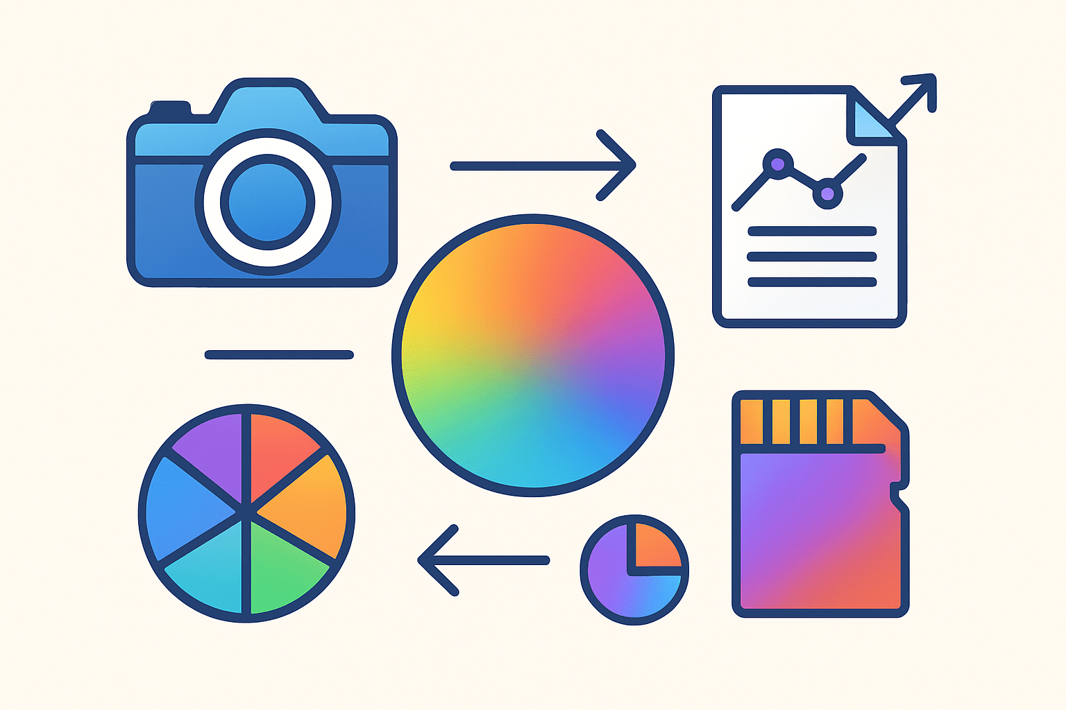
What is color space in photography — and why should you care about it?
It decides which colors your camera can capture, your monitor shows, and your printer can reproduce.
In this article we explain color spaces in plain English. You’ll learn about sRGB, Adobe RGB, ProPhoto, gamut, bit depth, and how RAW files fit into the process.
You will get a clear workflow from capture to archive, soft-proofing tips, and exact export settings for web and print. Read on for a quick answer, a printable cheat sheet, and step-by-step settings you can use today.
What is Color Space?
If you have ever wondered what is color space in photography, you are already on the path to better-looking photos. Color can only be shared accurately when everyone speaks the same language. A color space is that shared language between your camera, your screen, and your printer.
Quick answer: A color space in photography is a standardized system that defines how colors are represented numerically so cameras, screens and printers can reproduce the same colors — it defines the range (gamut) and how color values are encoded.
Think of it like a painter’s palette. The color model is the idea of mixing red, green, and blue, but the color space is the actual size of the palette and the exact pigments available. A bigger palette offers more intense paints, but it also demands more care.
It helps to separate models from spaces. RGB, CMYK, and LAB are color models. sRGB, Adobe RGB, and ProPhoto RGB are color spaces that live inside the RGB model, each with a defined range and math for encoding values. That is why two RGB files can look different: they may use completely different RGB spaces.
Gamut is the range of colors a space can hold. sRGB is small and safe, Adobe RGB reaches further into greens and cyans, and ProPhoto RGB stretches far beyond both. Some vivid greens and bluish-cyans you see in real life are outside sRGB but inside Adobe RGB, and more still fit only inside ProPhoto.
Devices also add complexity. Many spaces are device-independent targets used to translate between devices, while your monitor and printer are device-dependent and need their own ICC profiles. CIELAB is a common device-independent reference, so it is often used during conversions.
RAW files add another twist. A RAW file does not live in sRGB or Adobe RGB until you process it. The camera’s color space setting mainly affects the embedded JPEG preview and histograms. Your RAW editor chooses a working space later, which is where the color space truly starts to matter.
A brief technical note helps here. Color values are encoded with bit depth, such as 8-bit or 16-bit per channel. 8-bit gives 256 steps per channel and is fine for delivery. 16-bit jumps to 65,536 steps per channel, which is helpful when working in wide-gamut spaces to reduce banding during strong edits.
Imagine a simple Venn diagram with sRGB as the small circle, Adobe RGB around it, and ProPhoto RGB around both. That mental picture explains why a file edited in a wider space can hold more saturated colors without clipping them away during the edit.
If you open a dialog in Photoshop called Assign Profile or Convert to Profile, you will see how spaces are applied. Assign reinterprets the numbers under a new profile, which can make colors shift wildly. Convert changes the numbers to preserve how the image looks in the new space.
For a friendly primer on these foundations, skim through color space 101 and then come back to set up your workflow. Knowing the vocabulary will make the next steps easy.
One last note before we move on. The main keyword phrase what is color space in photography is really about matching color across devices reliably. Color spaces, profiles, and bit depth are the three pieces that make that promise happen.
Key Color Spaces in Photography
Let us tour the color spaces you will meet most often, and match each to real work. We will start with the one you already use, even if you did not know its name.
sRGB is the standard for the web and most consumer screens. It is compact, predictable, and supported almost everywhere. When you export for social media or send quick previews to clients, sRGB keeps you out of trouble.
The strength of sRGB is compatibility. Modern browsers and phones expect it, and many platforms convert uploads to it anyway. The tradeoff is a smaller gamut, so some saturated greens, cyans, and deep teals may get clipped or look dull compared to what you saw in edit.
Adobe RGB (1998) expands the green and cyan parts of the gamut. It was designed to better match print workflows where those hues matter, especially with high-quality inkjet printers or labs that understand ICC-managed files. When prints allow it, Adobe RGB can reproduce richer tones than sRGB.
The upside of Adobe RGB is color headroom in the greens and cyans. The downside is that unmanaged displays or apps might misread the file, making colors look washed out. If you deliver Adobe RGB, be sure the receiver uses color-managed software and knows what to do with the profile.
ProPhoto RGB is the big one. This space was built to encompass most colors you can photograph and even some beyond human vision. It is the best editing and archival space because it preserves the most potential color during heavy retouching and compositing.
ProPhoto is powerful but demands respect. Work in 16-bit to prevent banding and posterization because the space is so wide. Convert to your final output space at the end, and always embed the profile so other software knows how to render it.
CIELAB (often written as Lab or L*a*b*) is not a typical working space for most photographers, but it is useful to understand. Lab is device-independent and more perceptually uniform, so it is often used behind the scenes for measuring color differences and converting between profiles.
If you edit directly in Lab, you can perform some specialty adjustments like targeted color tweaks without affecting lightness. Most photographers do not live in Lab, but it is a reliable bridge that helps keep appearances consistent during conversions.
CMYK is a printing model rather than a single universal space. There are many CMYK profiles, each describing a specific press, paper, and ink set. Converting to CMYK is a final step for press work, and it must be done using the exact target profile provided by the printer.
If you need a quick mental comparison, picture three paint boxes. sRGB is the travel set, Adobe RGB is the studio box with extra greens and cyans, and ProPhoto RGB is the master cabinet. You can mix everything you need in the cabinet, then pour a small amount into the travel set when you only need to show someone online.
In day-to-day use, sRGB is your safest final export for the web. Adobe RGB is a smart choice for print when the lab or your own printer supports it and you soft-proof properly. ProPhoto RGB is the right choice for your master files and deep edits, where you want to avoid throwing away color too early.
Imagine a side-by-side crop of a tropical bird. In sRGB the cyan feathers might look a touch flat, in Adobe RGB they hold more vibrancy, and in ProPhoto they remain fully intact during editing, only to be shaped to the final space at export. Editing wide then exporting correctly is the practical lesson.
If you are torn about printing choices, a concise primer on the best color space can clarify how different labs handle profiles. Always ask the lab which space they prefer, and test with a small print before committing to a full run.
As you absorb this, remember the phrase what is color space in photography. It is not just a label on a menu. It is a promise that numbers in your file will mean the same thing from edit to output.
Color Space Workflow for Photographers
Your workflow is where color spaces pay off. A clear sequence prevents surprises, saves time, and delivers consistent results across screens and prints.
Start with capture. Shoot RAW whenever possible so you keep the maximum data and postpone color space decisions until you edit. The color space setting in your camera mainly controls the JPEG preview and histogram, not the underlying RAW data.
If you must shoot JPEG, choose the space based on destination. For web and general sharing, pick sRGB in the camera. For lab prints that request Adobe RGB, you can choose Adobe RGB, but only if you know your entire path will keep that profile intact.
Move to import and working space. Lightroom and Camera Raw use a very wide internal space, similar to ProPhoto RGB, so you have editing headroom from the start. In Photoshop, set your Working RGB to ProPhoto RGB with 16-bit when you do heavy color work, or Adobe RGB if your edits are moderate.
Check your color management policies. In Photoshop, set the policies to preserve embedded profiles and ask when opening if there is a mismatch. This prevents accidental conversions or silent profile assignments that shift color.
Edit thoughtfully with a calibrated monitor. Use a hardware calibrator like X-Rite or Datacolor to create a monitor profile, and aim for D65, gamma 2.2, and around 120 cd/m² if you print, lowering brightness to match paper whites. Recalibrate monthly or when your room’s lighting changes.
Keep an eye on gamut during edits. Enable gamut warnings for your intended output so you can see which colors will clip in the final space. Pull back saturation or adjust hues selectively to keep detail inside the target gamut.
Soft-proof before you commit. Choose the printer or lab ICC profile in your editing software, select a rendering intent, and toggle the preview to compare. Make gentle adjustments while soft-proofing to land on a print-ready look that matches your screen.
Rendering intent matters. Perceptual is helpful when many colors are out of gamut because it compresses them smoothly. Relative colorimetric with black point compensation preserves in-gamut colors and shifts only the out-of-gamut ones, which can work well for accurate hues and neutral tones.
Export for the web with care. Convert to sRGB, save as an 8-bit JPEG, and embed the sRGB profile so color-managed browsers display it correctly. Use a quality setting around 70 to 85 to balance detail and file size, and check the result on a phone and laptop.
Export for printing with intention. Convert to the lab or printer’s ICC profile only at the final step, and embed the profile so their RIP software reads it properly. For high-end inkjet or pro lab, send 16-bit TIFF or PSD when requested, and include any required layers or sizing instructions.
Press work asks for CMYK conversions. Obtain the exact press profile, convert using that profile, and soft-proof again in CMYK to catch shifts in saturated blues and greens. If possible, run a contract proof to lock in expectations.
Archive your masters to future-proof your work. Save a layered TIFF or PSD in ProPhoto RGB, 16-bit, with the profile embedded and full metadata intact. This master lets you re-export to any future platform without re-editing from scratch.
Here is a simple checklist you can follow from start to finish. Capture in RAW, edit in a wide-gamut space at 16-bit, soft-proof to your target, convert to the final profile at export, and always embed the profile. Save a ProPhoto 16-bit master so you can return later without losing color.
For deeper reading on managing profiles across devices, this concise color management guide is worth bookmarking. Understanding conversions and policies once will save you from many hours of troubleshooting.
To visualize the process, imagine a simple flowchart. Capture leads to wide-gamut editing, then soft-proofing, then conversion to sRGB or a printer ICC, then delivery or print, and finally archiving a ProPhoto 16-bit master.
Save this one-line cheat sheet so you do not forget. Web equals sRGB JPEG 8-bit with an embedded profile, Master equals ProPhoto RGB 16-bit TIFF or PSD, Print equals soft-proof and convert to the printer ICC before export.
If you need real numbers to start with, try these export settings. For web, sRGB JPEG at quality 80, 8-bit, sharpen for screen, and include the profile. For print, 16-bit TIFF, converted to the printer ICC, at the exact print size and 300 PPI unless your lab says otherwise.
Each of these steps keeps the promise behind what is color space in photography. When you hold to the sequence, your colors stay predictable from capture to delivery.
Choosing the Right Color Space for Your Workflow
Picking a color space gets easy when you base it on the final use. Think of it as a simple decision tree you can run in your head every time you export.
If your final output is the web or social media, convert to sRGB and export as an 8-bit JPEG with the profile embedded. This is the most compatible choice across browsers, phones, and social platforms.
If you are delivering to clients who do not specify a space, send sRGB for portability. If they run a color-managed workflow and request Adobe RGB, honor that request and make sure the profile stays embedded.
If you are doing heavy retouching or compositing, keep your master in ProPhoto RGB at 16-bit. That preserves delicate gradients and saturated colors throughout the edit, and you can convert to any destination later without redoing the work.
If you are preparing fine art or gallery prints, edit in a wide-gamut space and soft-proof to the printer’s ICC profile. Convert to that printer profile at the end, and export as 16-bit TIFF or PSD if the lab asks for it.
If you are sending files to press, edit wide, then convert to the exact CMYK press profile. Soft-proof in CMYK, check key colors like corporate blues and skin tones, and review a contract proof if color accuracy is critical.
Here is a pocket rule you can memorize today. Master equals ProPhoto RGB 16-bit, Web equals sRGB JPEG 8-bit with embedded profile, Print equals soft-proof first then convert to the printer ICC before export.
Let us run two quick real-world scenarios. A landscape photographer wants a 24×36 inch print with vibrant greens. They edit in ProPhoto at 16-bit, soft-proof to the printer’s ICC using perceptual intent, adjust local saturation to keep greens in gamut, convert to the printer profile, and export a 16-bit TIFF for the lab.
Now an e-commerce team needs product photos for a web store. They edit in a wide space but export as sRGB JPEG at quality 80, 8-bit, and embed the profile. They review on a calibrated monitor and on a phone to confirm the color looks consistent and clean.
If you need to decide on a print-specific space, consult your lab and study a dedicated primer about choosing a color space for prints. Many labs publish recommended settings similar to Adobe RGB or exact ICC profiles that map your file to their printer and paper.
As you apply these rules, keep repeating the idea behind what is color space in photography. The best space is the one that carries your color safely to the finish line you chose.
Color Space and Color Management
Color management is the system that keeps color consistent as your image moves between devices. It uses ICC profiles to describe devices and convert colors so the appearance stays stable.
Every device has a profile. Your monitor profile describes how your screen displays color, and your printer profile describes how ink lands on a particular paper. When you export an image, embedding the profile tells other software exactly how to render the file.
Monitor calibration is the foundation. Use a hardware calibrator like X-Rite or Datacolor and aim for D65 white point, gamma 2.2, and around 120 cd/m² brightness for print-oriented work. Recalibrate monthly or whenever ambient light or monitor age shifts the display.
Know the difference between assign and convert. Assign profile reinterprets existing numbers under a new profile, which changes the appearance. Convert to profile changes the numbers so the appearance is preserved in the new space, which is what you want for preparing output.
Rendering intents control how out-of-gamut colors are handled. Perceptual scales many colors smoothly to fit the new gamut, while relative colorimetric tries to keep in-gamut colors untouched and only maps the out-of-gamut ones, often with black point compensation for shadow detail.
Watch for common issues and quick fixes. If colors look dull after uploading, you likely posted Adobe RGB by mistake, so convert to sRGB before sharing. If you see banding after a hard edit, you probably worked in ProPhoto at 8-bit, so switch to 16-bit during edits and only go 8-bit on export.
If prints do not match your screen, start by lowering monitor brightness, recalibrating, and confirming you used the correct printer ICC profile. Soft-proofing with that profile beforehand usually solves surprises.
Different platforms behave differently with profiles. Most modern browsers are color-managed, but some apps and social platforms still strip or convert profiles on upload. Test with a private post, confirm the result on multiple devices, and always embed the profile.
Run a quick preflight before sending or uploading. Confirm your output target, soft-proof to it, convert to the correct profile, embed the profile, set the right bit depth and file type, and save a separate copy for delivery so your master stays untouched.
If you want to go deeper into troubleshooting, keep a small test image handy that contains saturated colors, skin tones, and neutrals. Export it with your chosen settings, check it across devices, and adjust your workflow once rather than guessing every time.
By pairing good profiles with the right spaces, you turn a once-mystifying topic into a set of repeatable steps. That is the true promise of color management for photographers who care about consistent, beautiful color everywhere their images appear.
What People Ask Most
What is color space in photography?
Color space in photography is a system that defines the range of colors a camera, screen, or printer can capture or show. It helps make sure colors stay consistent from capture to display.
Why does color space matter for my photos?
It affects how true and vivid your colors look when you edit, share, or print images. Choosing the right color space helps avoid dull or wrong-looking colors.
Should I use sRGB or Adobe RGB for online photos?
For most online photos use sRGB because it matches most screens and web platforms, so colors look as expected. Adobe RGB is more useful if you plan on serious printing or advanced editing.
Can a wrong color space make my photos look different on other screens?
Yes, using the wrong color space can cause colors to shift or look washed out on different devices. Proper color management helps keep colors consistent across screens.
How do I change color space in my camera or editing software?
Most cameras and editing programs have a simple setting to pick a color space when shooting or exporting. Choose based on where the image will be shown, like web or print.
Is a wider color space always better for beginners?
Not always—wider color spaces capture more colors but can be harder to manage for safe online use. Beginners benefit from sRGB for everyday sharing and a wider space only when needed for printing.
Will converting color spaces damage my images?
Converting can slightly change colors if not done carefully, but using proper export settings and previewing helps avoid big issues. Always check your image after conversion to be sure colors stayed true.
Final Thoughts on Color Space
If one number sticks with you from this guide, 270 — let it remind you that small profile choices can have outsized effects on how color travels from camera to screen and to print. This article turned the abstract idea of color spaces into practical, step-by-step guidance so you can make predictable decisions and keep your colors looking true across outputs.
Be realistic: wide-gamut editing calls for 16-bit files, a calibrated monitor, and careful soft‑proofing, because careless conversions still produce muddy or clipped prints. We began by defining what a color space does, then compared sRGB, Adobe RGB and ProPhoto, walked through capture-to-export workflows, and offered troubleshooting tips photographers actually use.
If you shoot for prints, fine art sales, or demanding clients, keeping a ProPhoto master plus exported sRGB or printer-specific files will save headaches later. Keep experimenting with profiles and proofs; over time you’ll build habits that make color predictable and calming, so your images match the vision you had behind the lens.


0 Comments